Showing posts with label visualization. Show all posts

Wednesday, March 25, 2009

This just in...


Quite the recurring subject, new stats on the war over your inbox. Seems that Yahoo is ahead of the game, followed by Windows Live virtually tied with AOL. Published by GOOD Magazine.


Delicious Del.iciou.us

Tuesday, March 24, 2009

Yet another baby!


Many Eyes has just released a brand new baby for us to delight ourselves with. We're all very familiar with the Word Tree and the Tag Cloud and Wordle features and I for one couldn't help to wonder what would happen if the clouds met the trees. Well, always one step ahead, folks at VCL have answered that question! Let's have a look...

When to use a Phrase Net

A phrase net diagrams the relationships between different words used in a text. It uses a simple form of pattern matching to provide multiple views of the concepts contained a book, speech, or poem. [...] The program [draws] a network of words, where two words are connected if they appear together in a phrase of the form "X and Y"


How Phrase Net works

Phrase net analyzes a text by looking for pairs of words that fit particular patterns. You can specify this pattern by using asterisks as wildcard characters. For instance, the pattern "* and *" will match phrases like "play and sing" or "vexation and regret." Punctuation matters, so it will not match "left, and then". You can choose from some useful defaults or you can type your own patterns in the field below the list.

Once you've specified a pattern, the program will create a network diagram of the words it found as matches. Two words will be connected if they occurred in the same phrase. The size of a word is proportional to the number of times it occurred in a match; the thickness of an arrow between words tells you how many times those two words occurred in the same phrase. The color of a word indicates whether it was more likely to be found in the first of second slot of a pattern. The darker the word, the more often it appeared in the first position.


I personally this is one of the most customizable visualizations in Many Eyes, making it extremely easy to think outside of the box, find new patterns in data, analyze texts, words and books and, well, just plain have some fun! Users can tweak the filters, zoom in and out, pan, highlight, see occurrences of the words and/or pair of words, hide or show common words and even choose the universe of words shown in the visualization. Phrase Net can process up to a million words from a single free text input.
For more [better written, more complete and thorough] information, visit Phrase Net's page on Many Eyes.
Check out the live thing below this image. (You need Java enabled to run any visualization on Many Eyes)


Delicious Del.iciou.us

Monday, March 16, 2009

"Who" goes around, comes around?


Recently, I've stumbled upon an extremely well constructed visualization for migration flows inside the United States: "COMINGS&GOINGS: Migration Flows in the U.S.". It's based on December 17th, 2008 research on how people move from state to state, which states people choose to move from and which they choose to move to. For instance, you can see in the first two pictures that California has been loosing residents way faster than they've been able to get new ones. In the last two images, we can also see how the Northeast region had a much larger outgoing flow than nowadays (the opposite goes for ingoing flow), specially from/to the West).
Since the actual meaning of the data - although very interesting and well portrait - is not really this blog's main topic, let's get to business!
Colors: very well chosen, the palette complements each choice very well. Only thing that I don't like all that much, even though it's not a real problem, is the orange and green for the population movements and here is why: it gives a sensation of positive and negative reinforcements - which, by the way, are taken inversely by most of the Asian community. In the west, we tend to relate green as good and red as bad, in the east, it's usually the opposite. Conclusion: not the best choice ever, but it's not a big deal. I'd have used either blue, yellow or play with the hues.
Format: ok, not much to say here. I mean, it's the map of the U.S. - not much opportunity for creativity here, nevertheless, very well drawn!
Animation: Well timed, well designed... Basically: Well done!!!
Interactivity: Extremely well thought, although not fully explored. The hovering is so refreshingly easy and intuitive to use, but we could have some clicking involved, allowing the user to compare multiple states or regions.

Conclusion: great work! The user does not need to read the entire article to get the gist of the data. So many different views and options to play with, this could entertain you for quite a while and you learn a lot in the process!
Cuddles to the creating team!

Ok! Time for you to let me know what you think!


Delicious Del.iciou.us

Tuesday, March 10, 2009

Watch over me


Recently I've taken a big blow in my personal life, but since this blog has absolutely nothing to do with personal lives, I'll live to this: MOTIVATION!
Nothing better for regrouping yourself than filling your day-to-day with structure, and when it comes to structure, the strictest, the better.
This brings us to Nathan's brand new mashup project: your.flowingdata. Far from being a unique idea, this project has a unique approach to it. Take Twitter, an already widely promoted, widely know and widely over-used web tool (I mean, even cell phones have been made so that it makes it easier to Twitter - it's changed the verb's meaning for crying out loud, you can't get any more know than that!) and mash it up with this very fresh project and you got yourself your very own watchman.
They way it works is you send private messages to a specific Twitter user with the correct keywords for the action your willing to report and it gets parsed into your very own activities log. Currently, actions being watched for are eating habits, entertainment, feelings, weight, sleeping habits, smoking and even bowel movements.
I've started watching over me today and as soon as it gets interestingly filled up, I'll be posting some statistics here - at least the not so personal ones!
The engine is still freezing a couple times since Twitters Whitelisting is not working as expected, but the results are in deed extremely refreshing.
I certainly hope this helps me get back on track...

Let me know what you think!

Delicious Del.iciou.us

Monday, March 9, 2009

Good chart x Bad Chart


Often I've criticized bad graphs, showing flaws, bad choices and mistakes along the way. Well, if creating a bad graph is easy, criticizing one is even easier, therefore, this post will show you a good graph, with the correct choices made in most places versus a bad one.
The good guy:

This graph was posted by the New York Times. Great choice of colors, nice labels and standard metrics. Very easy to understand. Not much to say really. The author didn't take that many chances, but the result was very straight-forward, which is good for the reader.

The bad guy:

Ok, now this guy has definitely taken a lot more chances than our hero. For absolutely no reason other then aesthetics, our villain decided not only to use a 3D presentation, but a curved presentation of the pillars. This decision, though very interesting and eye-catching, makes it rather difficult to compare correspondent values, creating a visual problem to understand the data. Plus, the curvature at the top of the image doesn't match the one at the bottom, which makes it even harder to read. The triple factor: the bar tops are not flat, but they have a curvature as well. Does that mean changes during that respective year's months? I think not. So what should we consider, top or bottom parts of the cut?

So you see what I mean, aesthetics is a very important part of making your graph successful and getting the information across, but it should never come at the expense of the objective, which is always to get the information as fast AND as correct as possible to the reader.

Let me know what you think!

Delicious Del.iciou.us

Tuesday, February 17, 2009

More on bad graphs


Ok, following on my very acid mood this week and after I read Nathan's from Flowing Data latest post on JP Morgan's Market Cap, which I had already seen and criticized back in January (only not on this blog), I decided to bring that little demon back and speak my mind once again.

First, let's take a glance at the graph:

The basics: Blue circles mean the market value pre-crisis and green circles mean the market value as of late January '09, both in the realm of billions of dollars.
The goal: show how hard everyone took it and given the scenario, how well JP Morgan managed not to lose as much value.
The error: trying to map 1-D values in 2-D objects without much attention to it.

So what's the big deal? The big deal is that when you use circles to map numbers, you HAVE TO remember that they are 2-D objects and as such, they have areas, which the cerebral cortex cars much more that ratio or diameter. What this means is that your brain cares much more about that area than about how tall that ellipse might be.

So how should the circles look like? Well, Rena Corda showed the world a revised version of it, here it is:

Can you see the difference? Ok, ok, maybe you don't find it that huge, but it is noticeable and as such, should be taken into account. We all know that statistics can be shown in many forms to make viewers/users agree more or less with the presenter's point of view and I personally think that this is a good thing, but there is a limit as to how much that can be used and JP Morgan's graph borders unethical information usage.
Let me know what you think...

Delicious Del.iciou.us

Thursday, February 12, 2009

Text2Image


This week, I stumbled upon a new text visualization: Text2Image, by Ted Davis. The concept is not at all new, basically put, it takes an array of characters and after processing, creates a sequence of colored blocks. Very poetic, very colorful, but also very mysterious. Although it seems to generate consistent results, there is no clue whatsoever as to how they are constructed, why different colors are chosen and why some letters generate longer strings of blocks.
Very interesting to play with, though!

Delicious Del.iciou.us

Tuesday, February 3, 2009

The new inconvenient truth


The present music running the American Economy... Sad, but true!
Using Microsoft Songsmith to analyze the numbers of the crisis, this visualization shows how bad the situation got over time... It's amazing how depressing the songs get when they come close to today's scenario.

Delicious Del.iciou.us

Tuesday, January 27, 2009

Sketches


In my morning readings, I've stumbled across a couple of visualization sketches from Grid/Plane in collaboration Instrum3nt for Google.
No big news there, except for a keen sense of design. I specially love the Map (title) and the columns (below). The map not only shows data beautifully, it also matches the data with a label on the bottom. I imagine panning, zooming, clicking, searching and intricate tooltips are a given in this sketch and if not, I'd like to think it wouldn't take long before they notice the need for it for better understanding the information and further gatherings.


As for these wonderful columns, I can almost see them moving and the animated tooltip formed labels dancing around. I do notice the lack of axis (and therefore the information you'd expect from them such as data type, name, origin and unit), but think about the selection opportunities if those boxes in each columns actually map a more detail level of information. By double clicking them, they could fall apart, forming new columns for the more detailed level while a zooming effect shows the user a close up the the selected data (Many Eyes' Block Chart example - play with the combo to get the idea).
These are only drawing, sketches, ideas... They don't actually map Google searches, but imagine when they do! For me, this will bring the word "googling" a whole new meaning.
By the way, when was the last time that a neologism widely accepted globally had it's meaning changed or even got a new meaning to it? this comes to prove once again that creativity is keen to success!

Delicious Del.iciou.us

Thursday, January 22, 2009

Addition to yesterday post


Yesterday, CNN posted a series of photos from the inauguration moment using Microsoft's Photosynth, "born of a collaboration between Microsoft and the University of Washington, based on the groundbreaking research of Noah Snavely (UW), Steve Seitz (UW),and Richard Szeliski (Microsoft Research)"1. The idea is that you can use a good number of 2D photographs to create a 3D environment of the moment. CNN posted 761 photographs in 3 separate groups allowing the user to navigate through various positions and points of view of the president taking his oath.
This way, you can see the moment from the first row or even right behind the president. You can navigate easily and intuitively through the photographs and have a close feeling of what that moment was like or, if you prefer, watch a slide show.
Definitely, a great display of the tools power and versatility.
Check out this other examples of what could be done with Photosynth.

Delicious Del.iciou.us

Wednesday, January 21, 2009

Hope

By now, virtually every single blog in the world wide web has an analysis on president Obama's inaugural address posted on their cover. I wish I could be different, but it's kind of a hard thing to do when such an important event comes to pass. There are very few things republicans and democrats agree 100% on, but that the next few years are crucial to the United States continuation as the number 1 political power on the world is a given. Well, along with the rest of the so called "Americans" and despite their supreme self-centered way of thinking, here is one Brazilian who is hoping the next 4 years are remarkably successful for president Obama. Having that said, I thought I'd take this opportunity to post all the most interesting things I've seen on the various blogs, newspaper websites and whatnot in one big post. Brace yourselves, this is a whole lot of reading ahead... I hope you enjoy it as much as me.

The projects will not be posted in any particular order, not chronological, not preferential, neither any other category that might suggest any connection among them, so please, do read 'em all so that you don't miss anything.

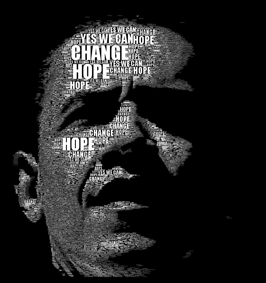
I'll start up with one of the records of posting, Obama's portrait as a tag cloud.

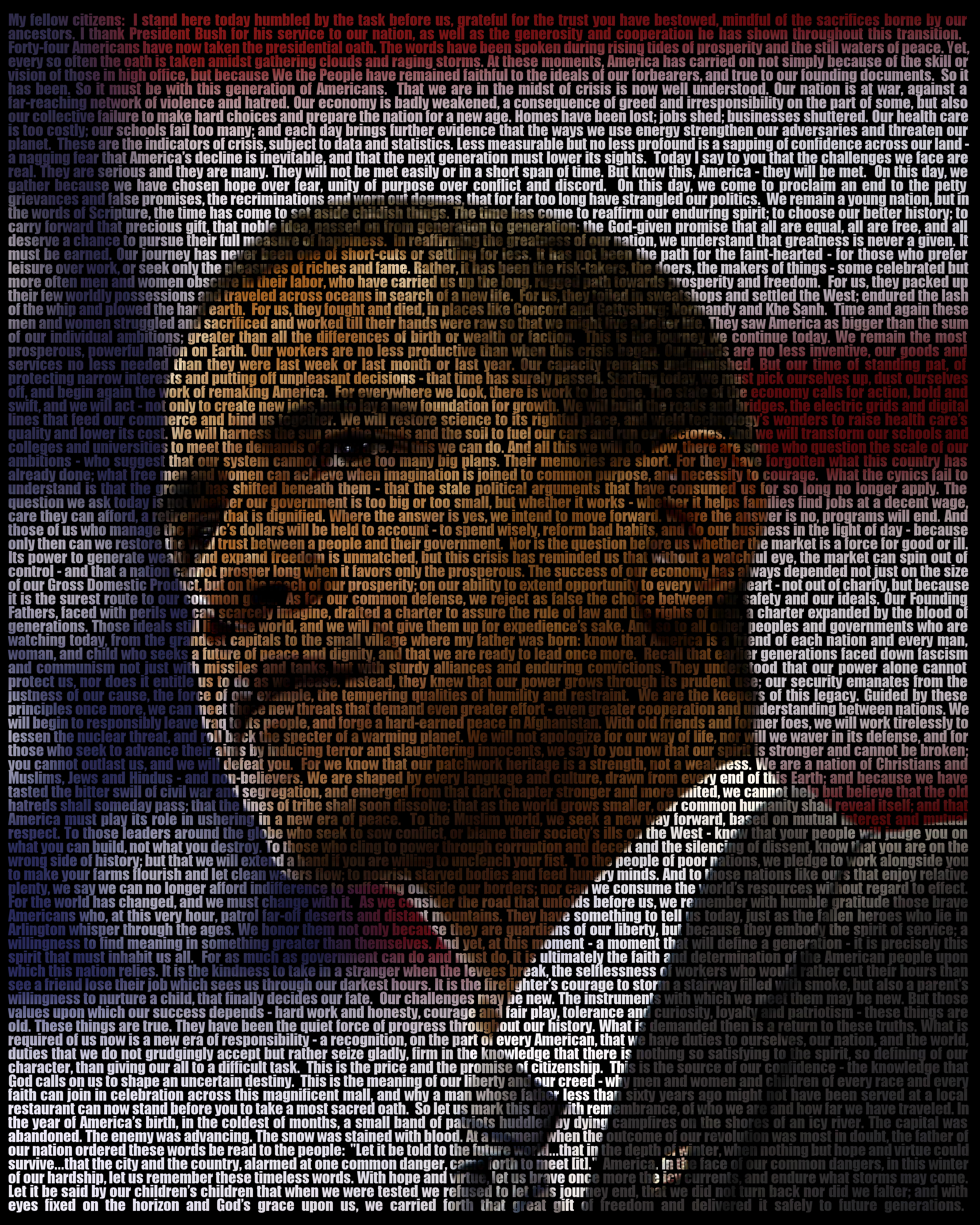
This project by Jeff Clark @ Neoformix, was inspired by an image by Gui Borchet. As a result, Jeff tweaked a few of his previews codes for Word Hearts and Clustered Words (which was Jeff's first attempt to build something similar to Jonathan Feinberg's widely praised and in my opinion, the very best interpretation of the well known tag cloud ever made, Wordle - also available on Many Eyes), making his code able to color and size words to fit a pre-existing image. There is virtually very little information data analysis or information the user is able to retrieve from it, but it is on heck of an image. This is visualization art in it's purest form. Cuddles for Jeff!
Here is president Obama's inaugural address' generated image:

Click here for original B&W portrait and here for original Inaugural Address image.

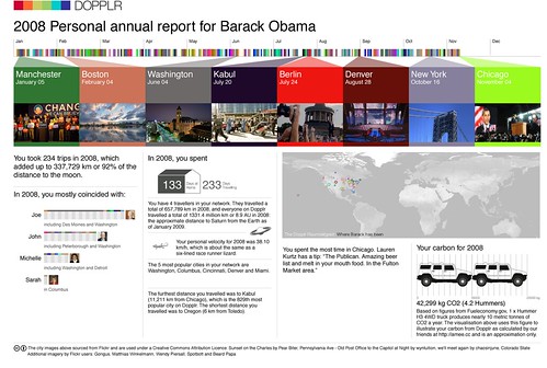
Here is Dopplr's visualization on 2008 Personal annual report for Barack Obama

As you can see, the man almost made it to the moon in 2008 (92% of the distance was covered) and spent almost twice as much time on the road then at home. Certainly showing commitment to his campaign. You can also see that Joe was with him most of the time and that John McCain was also present (even more than his wife Michelle - which reminds me of Chris Rocks' jokes on "Kill the messenger", very funny!) but McCain's VP Sarah, well, just not that much...
As a counterpoint, for someone who praises Gore's environmental issues that much, his carbon footprint was equal to more than 4 Hummers. OK, for that much traveling, and keeping in mind that airplanes do pollute a lot more than any other thing in this world, I guess it was not that much in perspective to the benefits his election might bring to our world in that subject. By the way, just for kicks, here is what Lauren Kurtz has to say to Mr. President Barack: you gotta go to "The Publican. Amazing beer list and melt in your mouth food". I guess now he is elect, a couple cold ones wouldn't be that bad!
You can download Dopplr's original PDF here.


I continue with one of the most interesting data correlation for the past year election, which I saw on Flowing Data.

This post election analysis shows the correlation between cotton picking and voting. The relation is amazingly synchronized. As Strange Maps does point out, this doesn't mean that by increasing the cotton plantations on other parts of the country would increase the number of democrats, but it does show that due to heavy migration of African Americans to those regions caused by the cotton industry, those counties had a significant majority of voters for Obama (91% of the African Americans population voted for Obama). This is a great correlation - not causation - example and a very interesting read.

This next piece, by OPEN N.Y., shows the correlation between height and weight in the presidency history dating back to 1896.

In this graph, it's clear that the seemingly more robust body has had an edge on presidential elections since the 25th president. Makes sense, since the people would rather have a leader they find fit. Yes, I know, fat is not fit! But remember that not that many years back, this fitness race of our time was not present and fatness did actually mean wealthier and healthier - which are strong qualities for someone we expect to run our country for the next years. Barack's win only confirmed this pattern, beating McCain's short and curved, Ephialtes-like figure.

You can find the original article here.


Next is Washington Post's post on tax proposals for both candidates.

As you can easily see, the main difference is that Obama's proposal was to increase the taxes by 5% of all those filthy rich multi-millionaire people we all love to hate and to wish were us while decreasing taxes for the bottom end of the financial pyramid while McCain's proposal was to lower taxes for everybody! Borrowing Phoebe's half brother Frank line on Friends: "No no no, this is a new plan! Three kids and no money!!!". Not quite getting what I meant? look at the bottom line: Obama's proposal equals virtually no change on the final tax amount while better organizing tax expense for the population. McCain's proposal equals more than a thousand dollars average in tax income while continuing to favor those in the big chairs! Not a mystery why Obama won the election. The least favored group by McCain's proposal meant 60% of votes, I mean, at least check your numbers Mr. McCain!

And for the Pièce de résistance, among so many others, here is Many Eyes' tag cloud of the inaugural address:

If you can't see this visualization, click here to see the original)
As you can see in this two-word tag cloud, this is indeed a new age, designed to be filled with the care for health, economy and hard work, with the lack of war and fights (hopefully!). It could not have come too soon! Let the new times begin!
Good luck Mr. President. Know that our hearts and minds are with you and we are more ready work hard and be lead back to the right side of things!

Let the good times roll!

Delicious Del.iciou.us

Friday, January 16, 2009

Backwards visualization (as an art form)


Wikipedia defines visualization as "any technique for creating images, diagrams, or animations to communicate a message". Usually, it's main goal is to make information clearer in a broad view. Though, Chris Jordan - known photographer - uses the concept backwards to prove a point, as a form of art.
Chris' work depicts the usual America (meaning U.S.) mentality, which seems to grieve for some disasters (Chris mentioned 9/11th as an example in his talk on TED back in June), but misses actual daily massive disasters (he also mentioned the 1100 deaths due to nicotine usage daily as an example).
He takes random expressive statistics about common habits simulates the usual view of the population on it by showing massive numbers of objects mashed together to form an image. When the viewer drills down to the picture detail, the actual object, subject of the piece, shows itself.
His main pieces can be found on his website (Chris Jordan Photographic Arts). The most impressive to me are the Oil Barrels, which shows 28.000 42-gallon barrels, the amount of oiled consumed in the U.S. every minute, Plastic Cups, portraying 1 million plastic cups - the amount of cups used on airline flights in 6 hours everyday in the U.S. (none of which are reused or recycled in any way) -, and the Cell Phones, which consists of 426.000 cell phones - the number of cell phones retired in the U.S. everyday.

You can enjoy Chris' talk on TED.

Delicious Del.iciou.us

Thursday, January 15, 2009

Chart Chooser


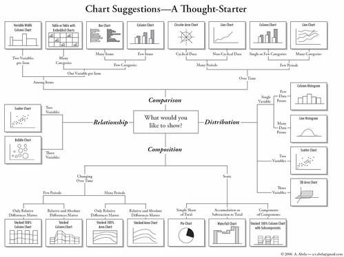
Recently, I read a post on Flowing Data about this Char Chooser "flow chart", which helps the user choosing the appropriate chart to represent their data. As a visualization enthusiast, I find the chart extremely limited and not much of a flow chart, but more of a category definition for charts according to data type or intention.
It serves it's purpose, nothing more, nothing less.

Then again, if you're not a visualization enthusiast or a visualization developer, this might help you get to the most appropriate chart to convey your ideas. No harm in taking a look there...

PS: Maps are lacking, and they've been more and more important as charts throughout history...

Delicious Del.iciou.us

Tuesday, January 13, 2009

Ford turns to visualization for new dashboard


In these crisis times currently scaring the market and with all the automakers craving the bailout for survival, Ford turns to visualization to boost sales with their new heavy info dashboard.
The new dashboards are projected to fit perfectly with greener cars. The goal is to change the way people drive. Using a "leafy" theme, the driver can visualize the impact their driving is making on the environment. For instance, when the driver aggressively accelerates or breaks, the vine withers and leaves disappear. Don't worry, as the driver gets back to driving economically, the withers and leaves grow back. The new dashboard should be standard in all Fusion Hybrids (starting at $27k).
The company hopes to make a strong statement with green-driven consumers, creating a state of loyalty with those concerned with the environment. Although Ford has been making strong attempts to tackle this market, they're still to post the sells on hybrid vehicles that can compete with the green-market emperor Toyota (over 1 million Priuses sold).
The dashboard was developed in collaboration with Smart Design, also responsible for the new Johnson & Johnson operating gowns and "reach wondergrip", MS Windows Packaging, HPs photoprinters, DashExpress GPS and Starbucks Hear Music Media Bar.

Seen on Flowing Data. Tracked back to Business Week.

Delicious Del.iciou.us

Tuesday, December 30, 2008

Football Data Gathering

The Pittsburgh Post-Gazette posted an article on inclusion of sensors in footballs and gloves being done by the students at Carnegie Mellon University. The project is to input sensors & accelerometers in football gears so that data can be derived and transmitted wirelessly, so that further analysis can be made. Obviously, the first implication would the refereeing changes (much like when the NFL decided to use replays as a final resource to solve disputes), but that does not interest us as much as the analyzing possibilities both during and post games. Imagine how many visualizations could be done using the field as a map, how many widgets online we could have to measure and point the grip on the catch. We could compare grip versus strength in the pass to figure out who's to blame for the incomplete pass. We could have a graphic of how much tired the receivers, runners, QB's were by measuring the sprints, throws and catches...
Well, the possibilities are infinite and creativity will definitely change the way we see the game.
Let's hope for the best!

Seen on Flowing Data

PS: Oh, yeah... And watch out for referees being out of jobs and super athletes on the way... JK!

Delicious Del.iciou.us
Thursday, December 25, 2008

Have yourself a merry little Christmas...


Happy hollydays everyone!
For this special ocasion, I've separated one of the most intuitive, yet, completelly original visualizations I've seen in the past few months, and here is the kick: IT WAS MADE BY FELLOW BRAZILIANS!
Angela Detonico and Rafael Lain, both brazilian, made this simple and wonderful "The World, justified" visualization. As a form of art, many interpretations, both philosophical, political and geographical can be made, yet since this is a very clever puzzle, I'll leave the thoughs run freely in your mind and limit my comments to:
Centralized Earth reminds me a little of Africa or a reflected South America. Given that thous are the most exploited continents of history, it's a bit strange that the concentrated land would that this specific form.
Wonderful job guys, and since we're all Brazilians here: Parabéns galera! Trabalho sensacional e palmas!!!

Seen on Strange Maps - Original: detanicolain.com

Delicious Del.iciou.us

Monday, December 1, 2008

On visualization...

Many visualizations have been made trying to make the product buying over the internet process, some trying to emulate physical book stores, others trying to incorporate visualization concepts in order to make it fun for users to find out information on the products, and some others... well some others have not made their point all that clear!
This week, I found out about Vizzl, a flex based tool for product searching on Amazon, eBay or even Youtube. This one falls into the second group: use of visualization concepts to enrich search processes. It's got animation and information well distributed and it keeps the UI simple. It's even got an introduction video to explain how it works, although not much explanation is needed.
There are some bugs and glitches, which I'm sure won't be there for long, and the idea is fairly simple and not that innovative. The most interesting part is the usage of Adobe Flex. In an era like this one, where we have so many options ranging from .Net & Silverlight, Java, Flex and so on, Flex does keep the application simple and light enough to make the user experience fast, somewhat robust and fresh.
The application is indeed fast and way more fun than searching Amazon itself, for instance, so check it out at Vizzl

Delicious Del.iciou.us

Thursday, November 27, 2008

Welcome to the world, Processing 1.0!

It only took 162 attempts (hey! It took Edison 1000 attempts to make the light bulb! shush!!!), but it's finally here: Processing 1.0!

There was even a press release for it last Monday in Cambridge and L.A., and it was well deserved. I'd explain what the project is, but Ben Fry - who is one of the authors - has already done a pretty good job...

"Processing is a programming language, development environment, and online community that since 2001 has promoted software literacy within the visual arts. Initially created to serve as a software sketchbook and to teach fundamentals of computer programming within a visual context, Processing quickly developed into a tool for creating finished professional work as well.

Processing is a free, open source alternative to proprietary software tools with expensive licenses, making it accessible to schools and individual students. Its open source status encourages the community participation and collaboration that is vital to Processing’s growth. Contributors share programs, contribute code, answer questions in the discussion forum, and build libraries to extend the possibilities of the software. The Processing community has written over seventy libraries to facilitate computer vision, data visualization, music, networking, and electronics." - Ben Fry

You can download it free here and find beautiful examples of usage here.
Hope you enjoy this, I certainly will!

Delicious Del.iciou.us

Wednesday, July 2, 2008

Appologies

This is a very short post I decided to write so that I can apologize to you, fellow reader.
In no way this is a justification for such a long hiatus between posts, it’s simply an informative post, so that you have an idea of the reasons.
First of all, my project at Dell has been taking all of my time lately with very few exceptions, which I’ve been using to catch up with my sleeping. Things have gotten complicated and let’s just say I’m hoping for a fast solution that will give my team and me some time to organize our thoughts and goals.
Second, because of my lack of spare time, I haven’t got the chance to play with VS2008, but I am writing a visualization project so that I can test the new framework features. There’s not much of it ready for implementation, but I’m inclined to build something related either to conversations through MSN Messenger and/or e-mails (special thanks for the class of 2007 for the relentless mails about soccer games, barbecues, lemons, etc...) or something related to my sports injuries – I’d like to take this moment to mention Tim and his visualization of injuries "Where does it hurt?" posted at his blog, which has inspired me to build something on the same sense.
So, I hope you guys can find it in your hearts to forgive me for the absent and please give me an input as to which of the visualizations would be more interesting.

Thank you.

Delicious Del.iciou.us