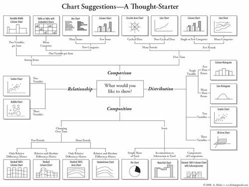
Recently, I read a post on Flowing Data about this Char Chooser "flow chart", which helps the user choosing the appropriate chart to represent their data. As a visualization enthusiast, I find the chart extremely limited and not much of a flow chart, but more of a category definition for charts according to data type or intention.
It serves it's purpose, nothing more, nothing less.
Then again, if you're not a visualization enthusiast or a visualization developer, this might help you get to the most appropriate chart to convey your ideas. No harm in taking a look there...
PS: Maps are lacking, and they've been more and more important as charts throughout history...


No comments:
Post a Comment